
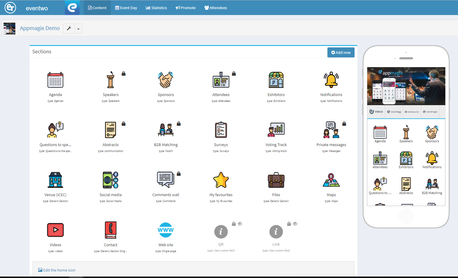
Content Module
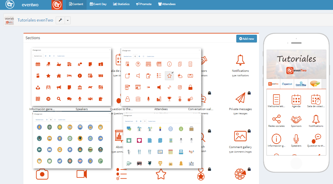
In this page, we find our App different sections. The screen is split into two parts.
On the left side, you will find all the icons with their functionalities and the proper customization.
At the right side of the screen, you will find how it would be displayed in your mobile device, helping us to have the "final picture" of our App.
Please, be always aware of the number of icons per line to maintain the quality of the designed App.
How to create new sections:
You only need to click in the blue button on the top right of the screen "Add New"; It will trigger a new menu to select which type of section we would like to create.
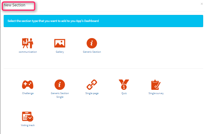
Once the section has been selected, we would find a form to be filled with the information about the new icon.
When the form is filled, we only need to click the "Create" button that would now be appearing in the main screening.
Icon edition and organization:
With the mouse in each icon, we would see the wrench icon with a drop-down list of edition options:
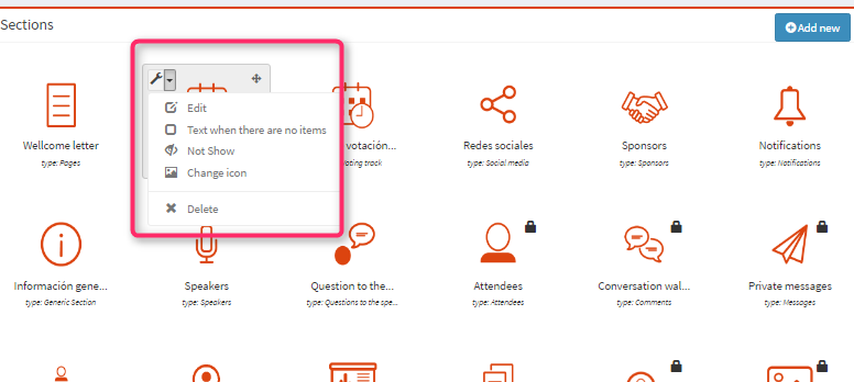
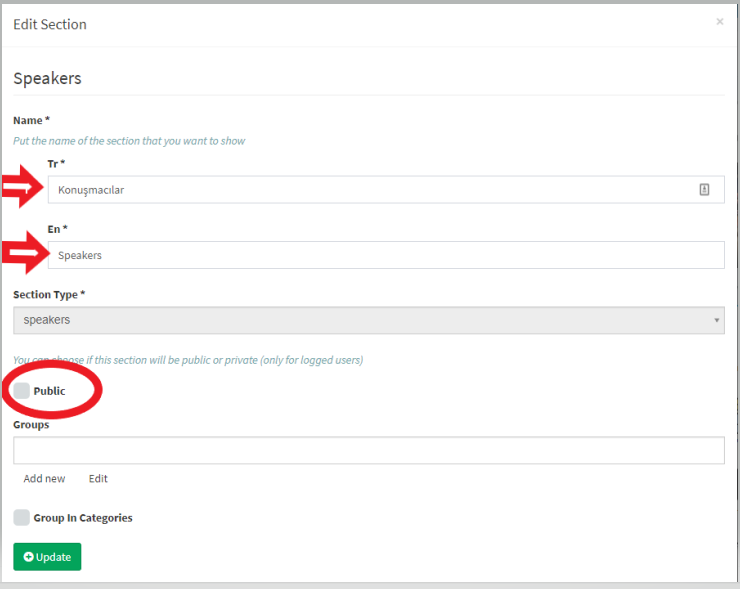
Edit:
We can modify the name of the icon and its privacy in the App.
Text when there are no item: Here we can include a brief sentence e.g. "the information will be available asap".
Not Show: We can hide an icon in the App.
Change / Select icon Set: We can select the icon more accurate for our module.
You will find six different sets of icons already designed to support you in your configuration. Therefore, you can also create your own set of icons for your app e.g. your company logo, event logo…etc. Please keep in mind that all icons have to be a .png format with a transparent bottom and 150px X 138 px. size.
For
further detail please click in the Video Tutorial below: